Triple P — Designing Across Emotional Territory
the brief
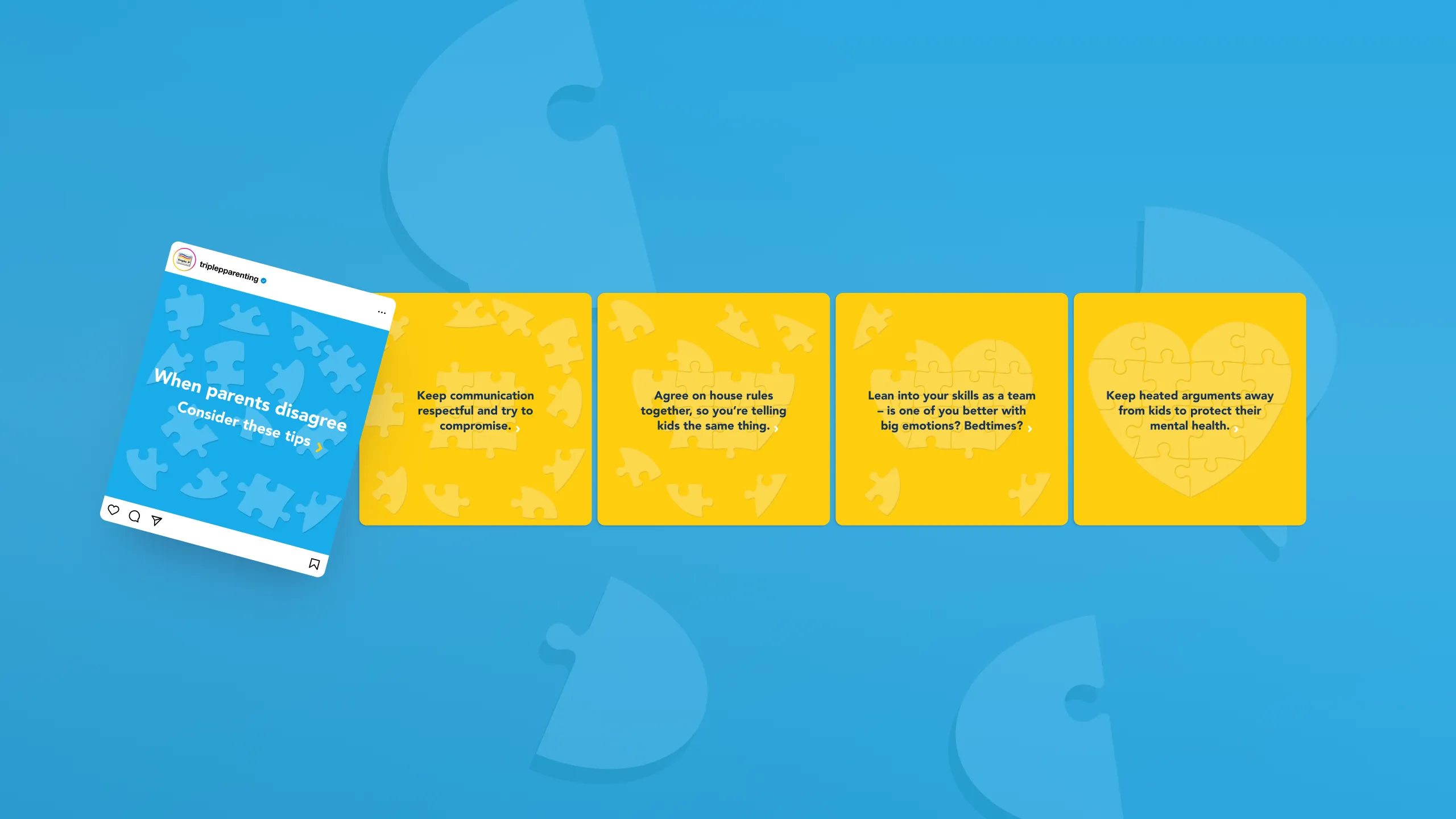
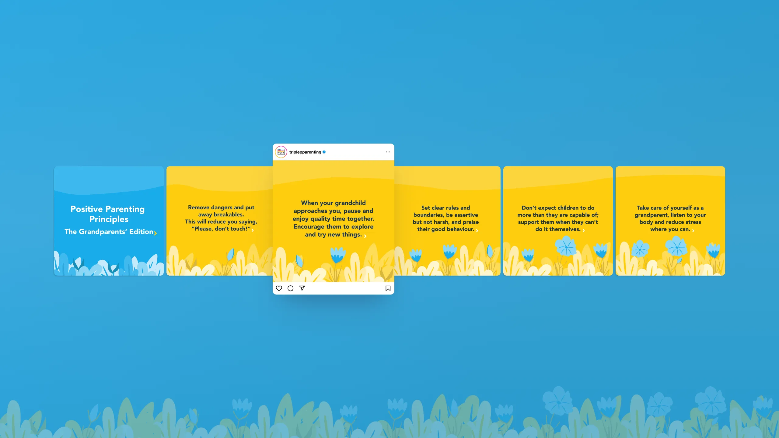
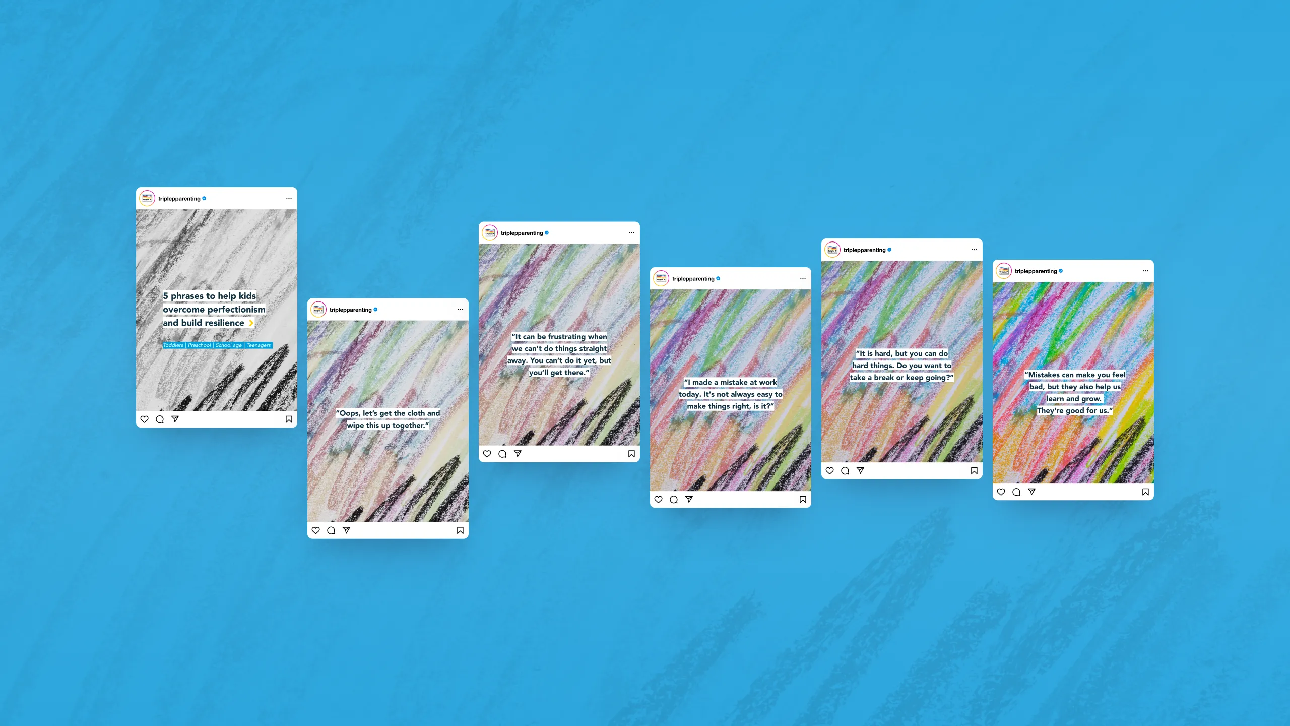
Triple P is a worldwide, accessible parenting programme, active in over 30 countries. Every piece of communication touches something personal and vulnerable in its audience: parents who are trying their best. Across three quarterly HUB campaigns — screen time and tech tantrums, parenting conflict and team parenting, and perfectionism and anxiety in children — the design challenge was consistent: make charged, complex emotional territory feel approachable, solution-oriented, and human. No blame, no shame, no sides.
the universal image problem
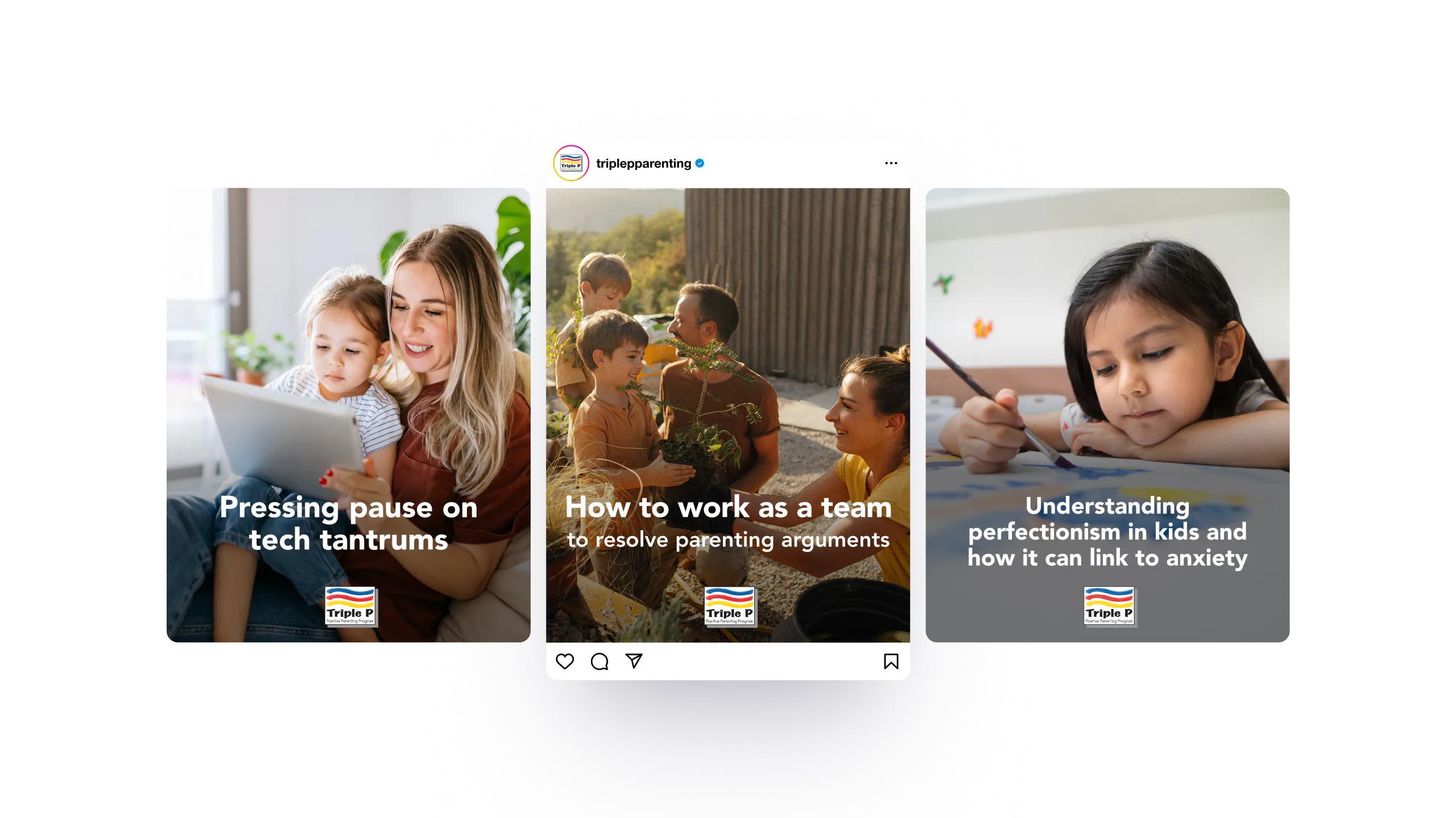
The campaigns run across more than 30 countries, from the US to Europe, Asia and Australia. Photography had to feel familiar to a parent in Seoul and a parent in Stockholm at the same time. The solution was to anchor visuals in universal human acts rather than culturally specific ones: a mother and child sharing a screen, a couple planting seeds together in a garden, a girl concentrated at a canvas. Gestures that transcend context. The emotional truth is in the action, not the setting.
the throughline
Across all three campaigns, the same structural principle applies: every series is designed as a progression. Each tile carries information, but the series carries an arc — from recognition of the problem, through practical tools, to improvement. That movement is not just in the text. It is built into the image.
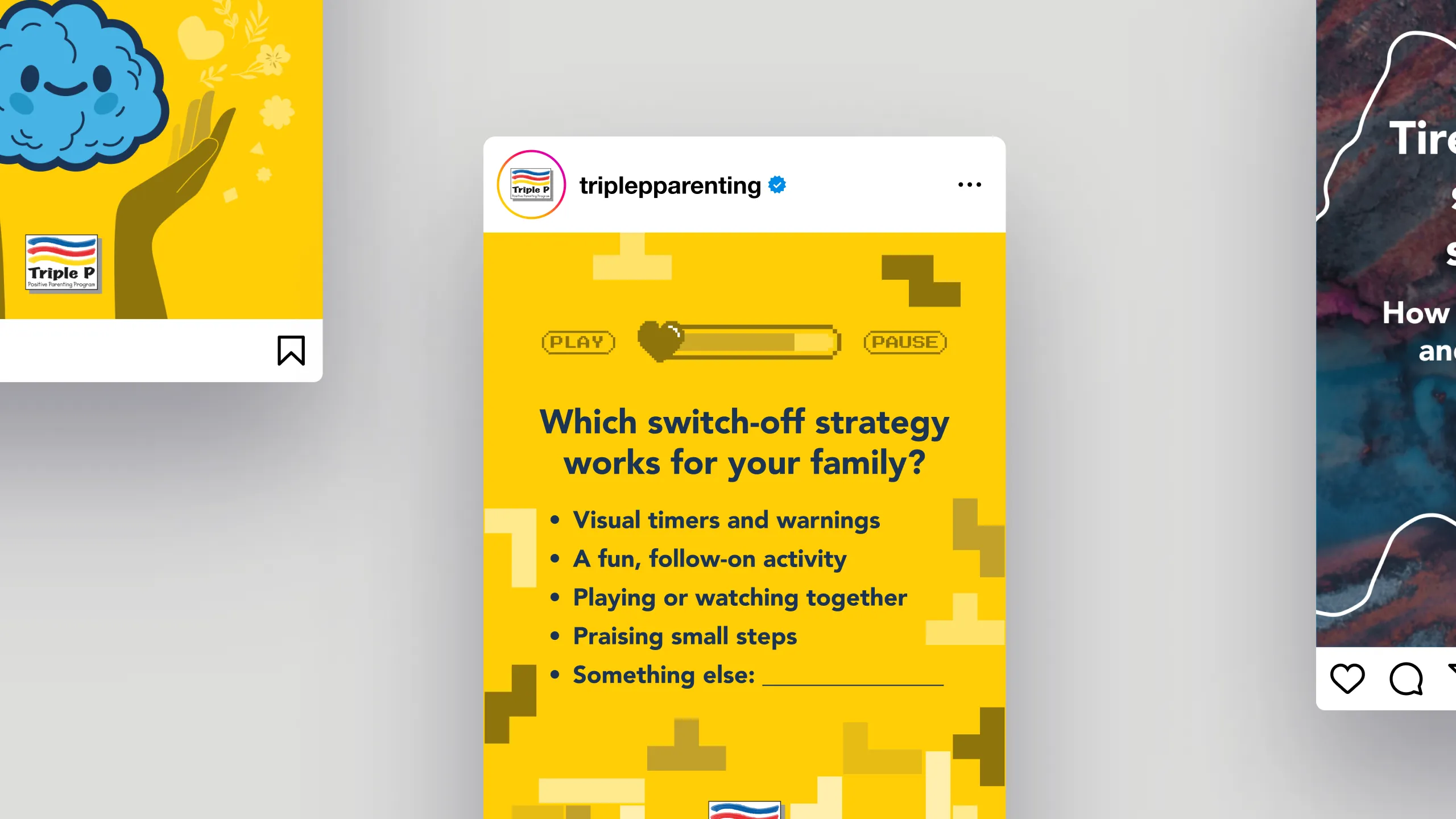
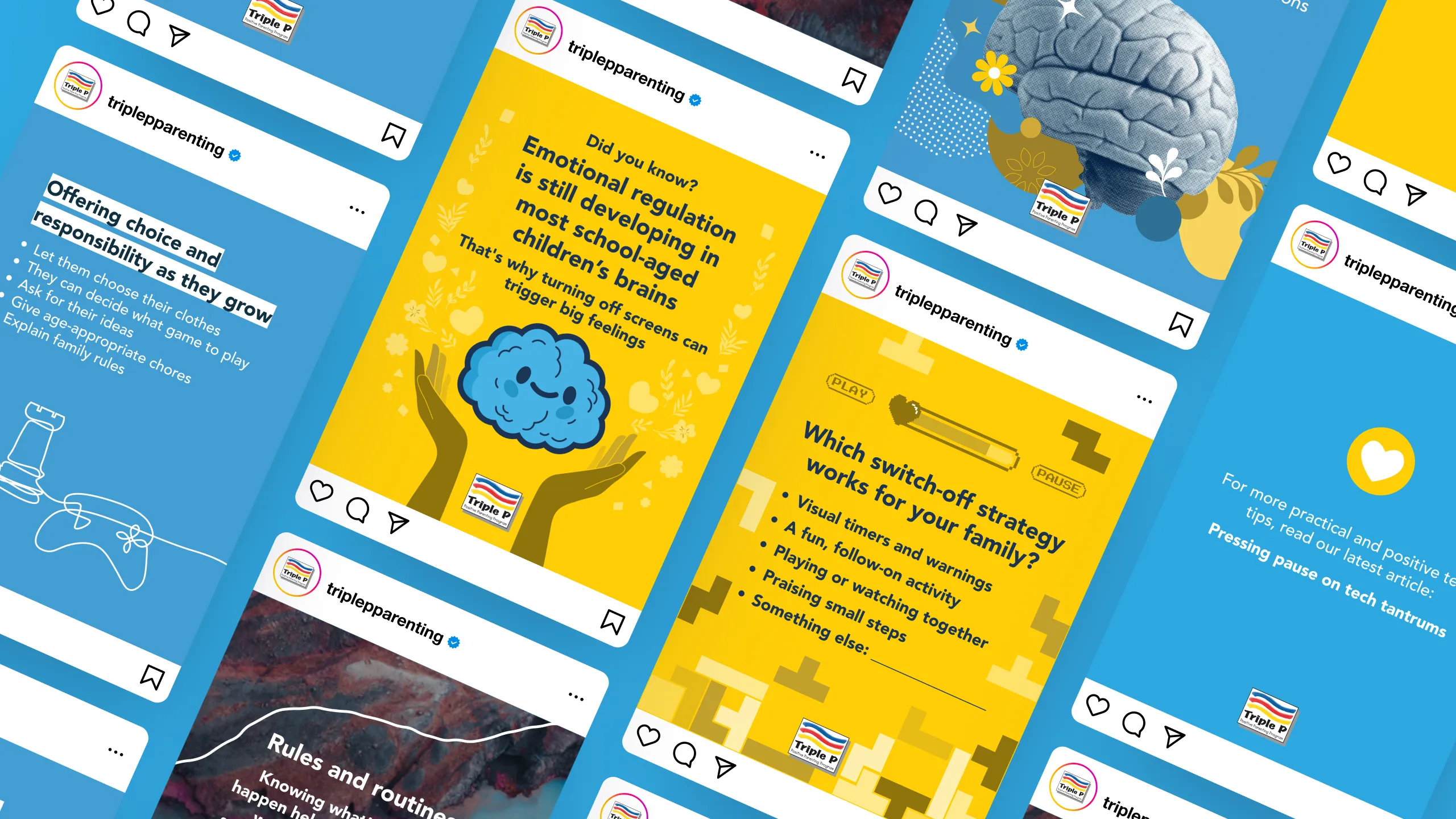
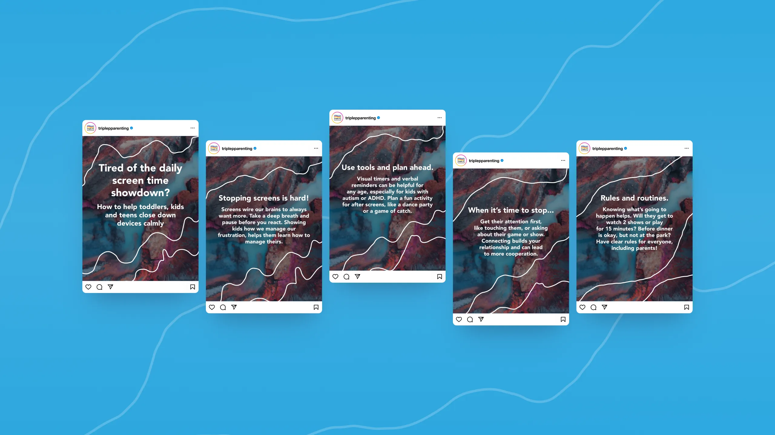
In the screen time campaign, the background reads as an abstract river — turbulent water suggesting overwhelm without literally showing screens. Overlaid currents mirror the agitation. As the series progresses, the currents settle. The composition breathes.
In the parenting conflict campaign, a puzzle in the shape of a heart lies scattered in the background. Tile by tile, the pieces move toward each other until the heart is whole. For the grandparents' extension, a flower opens gradually across the series. For the combined audience, the puzzle pieces become speech bubbles, connected or disconnected depending on where in the arc you are.
In the perfectionism and anxiety campaign, the background is built from deliberate marks and scratches. In black and white, they read as restriction and anxiety. As the series progresses, colour bleeds back in — slowly, frame by frame — until the image is fully saturated, expressive, alive.
→ Design principle: Regulation — the core message across all three campaigns — is visible in the image before a word is read.
brand consistency across territory
All three campaigns stay close to Triple P's brand palette of blues and yellows, extended into deeper tones for HUB-specific posts. Familiarity signals safety — important when the subject matter is already emotionally charged. The closing tile of the screen time campaign deliberately breaks the visual register: bold yellow, pixel graphics, retro game logic. Play, pause, progress, lives. Relief through contrast.
→ See it live: Triple P on Instagram