Reducations — Process Before Outcome
the brief
During the Graphic Design and Art Direction programme at Reducations, a selection of briefs pushed across different territories: corporate identity, retail rebranding, cultural communication, and brand strategy. The work here is shown as process and outcome — the thinking behind the image as much as the image itself.
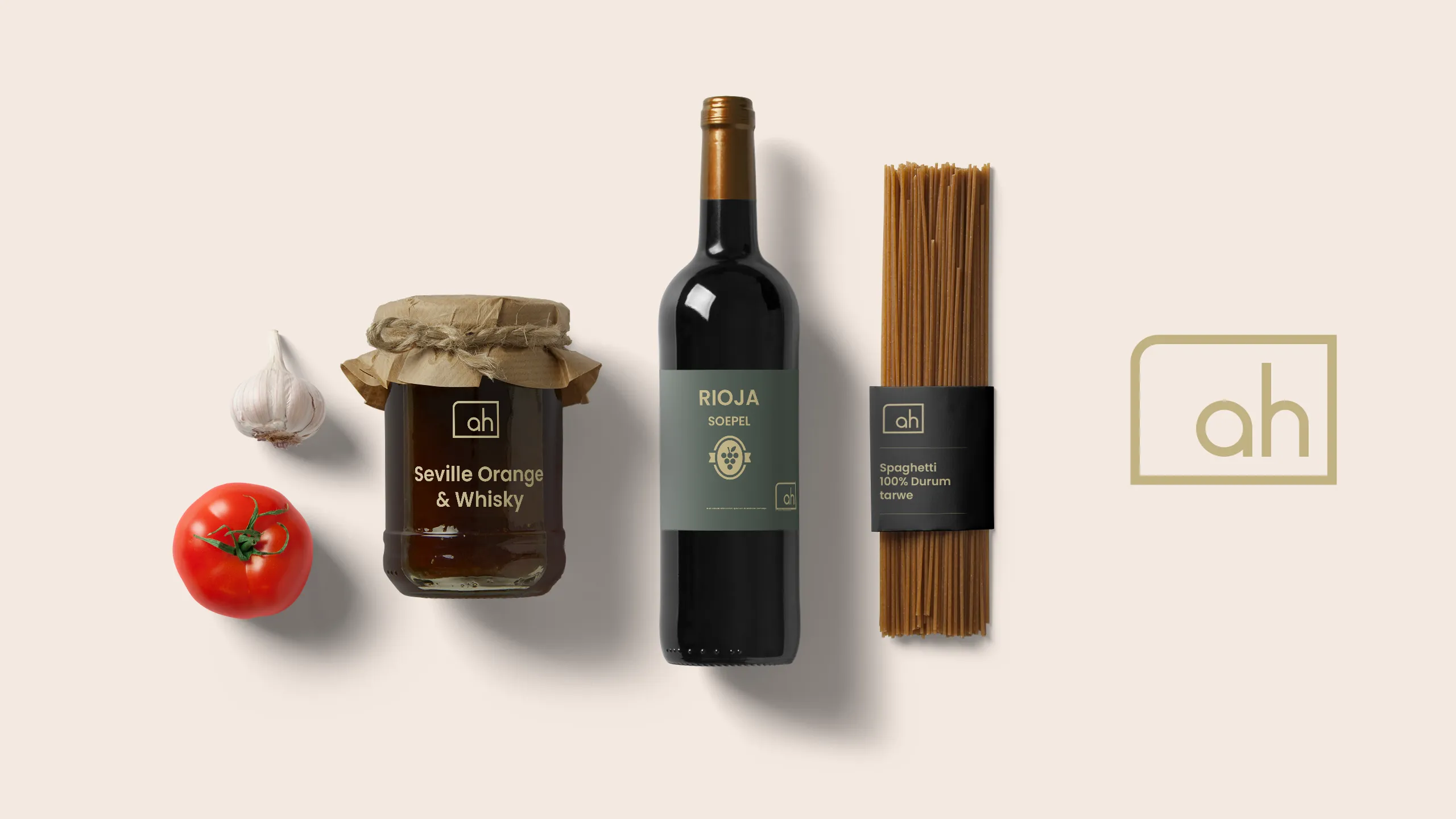
AH — rebranding for an artisanal sub-brand
A logo design brief with a methodical, research-driven foundation. The technical process is central to this project: structured iteration, visual reasoning grounded in brand logic. Two distinct outcomes emerged from the same brief — each a legitimate response to the same set of requirements, each making a different argument. The image speaks for itself.

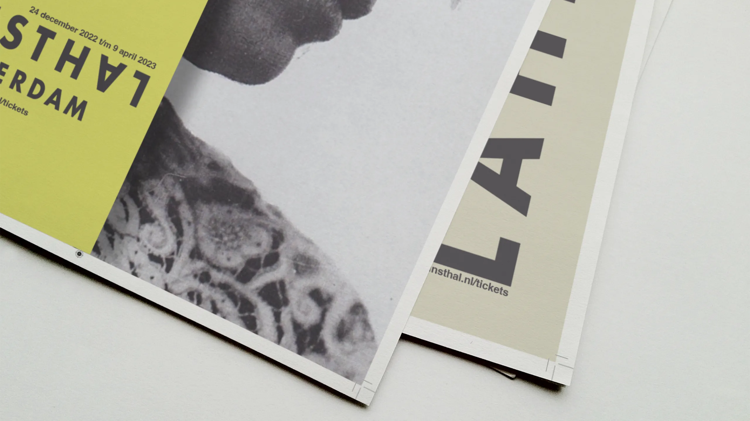
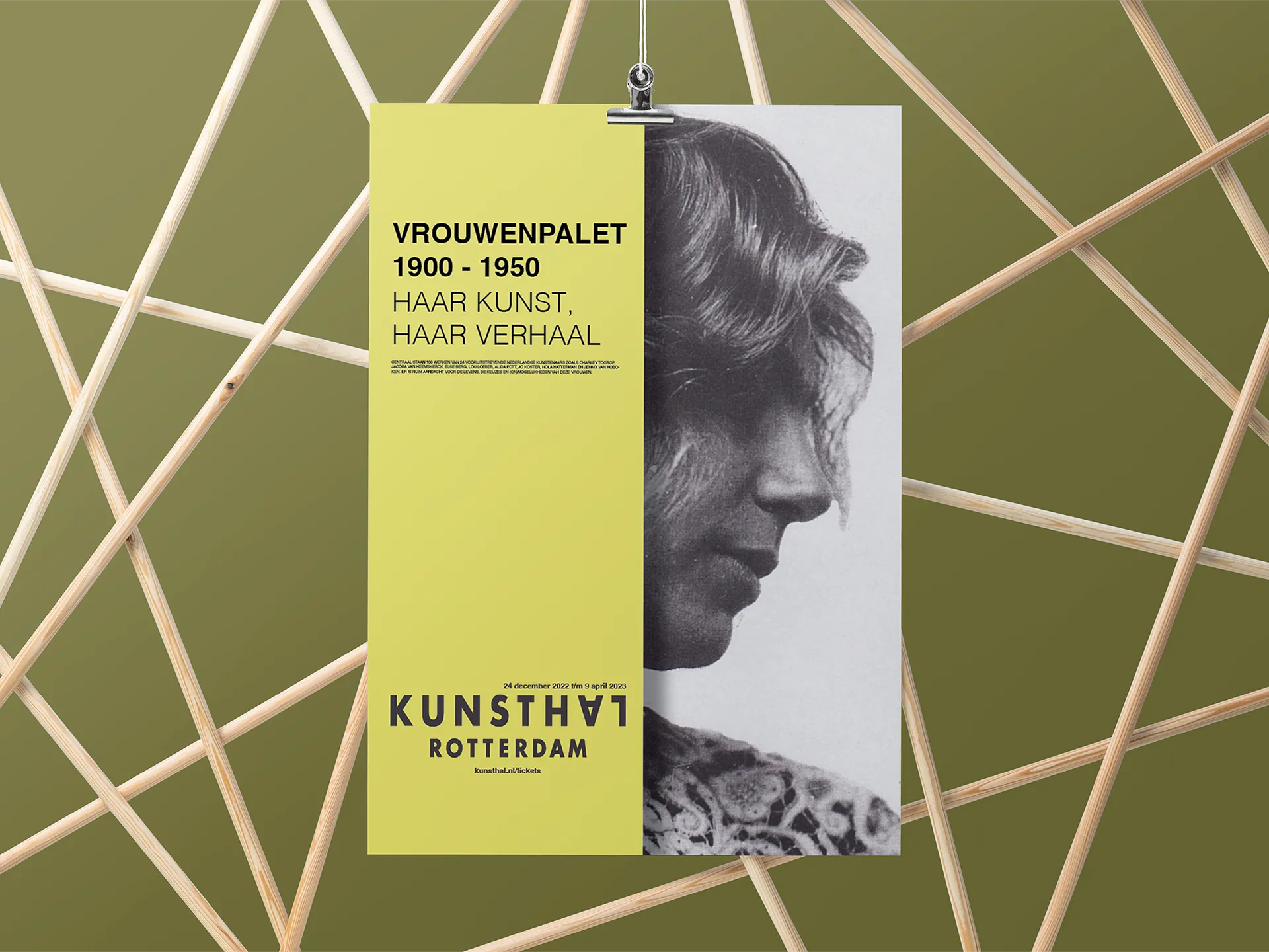
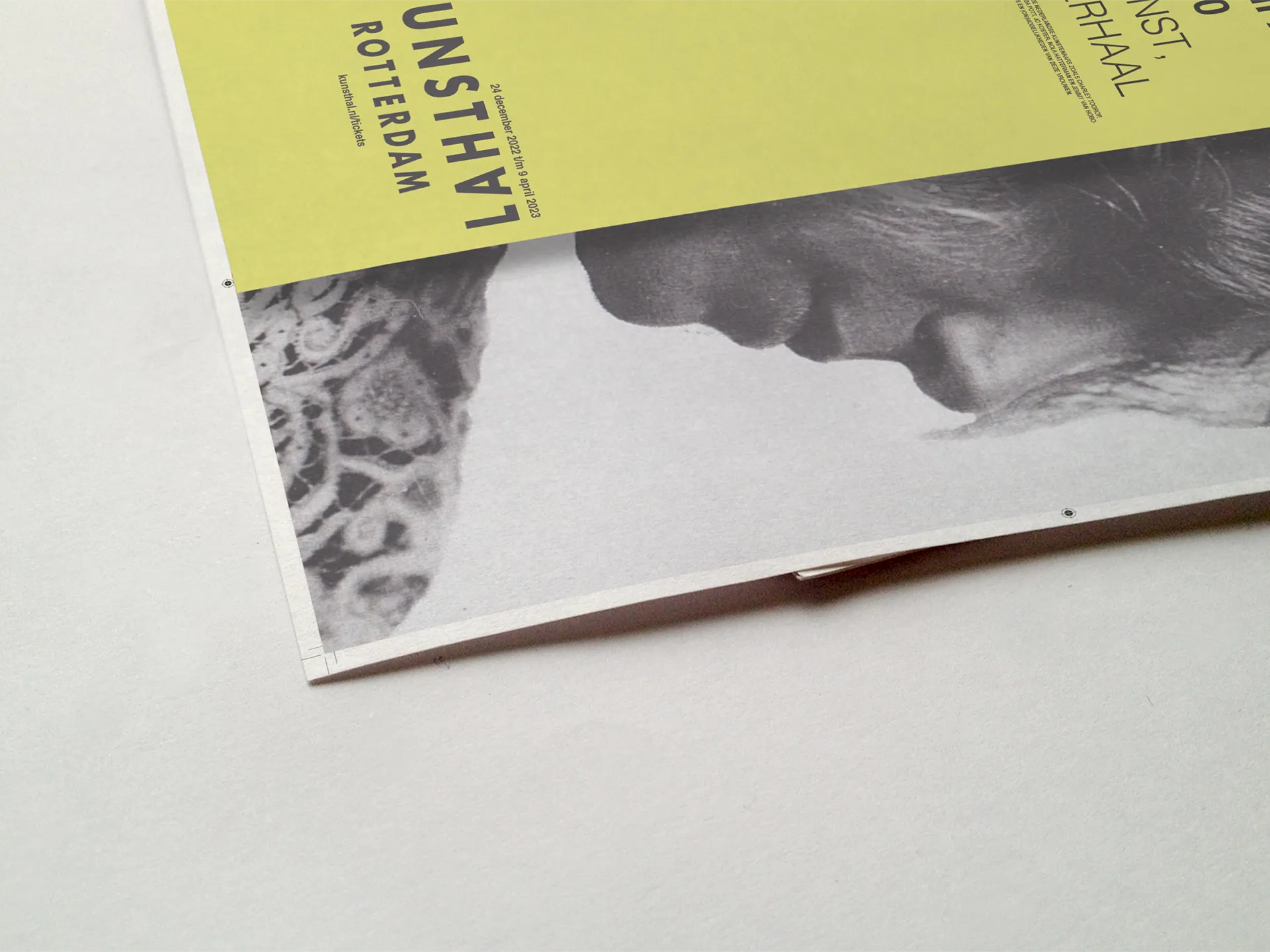
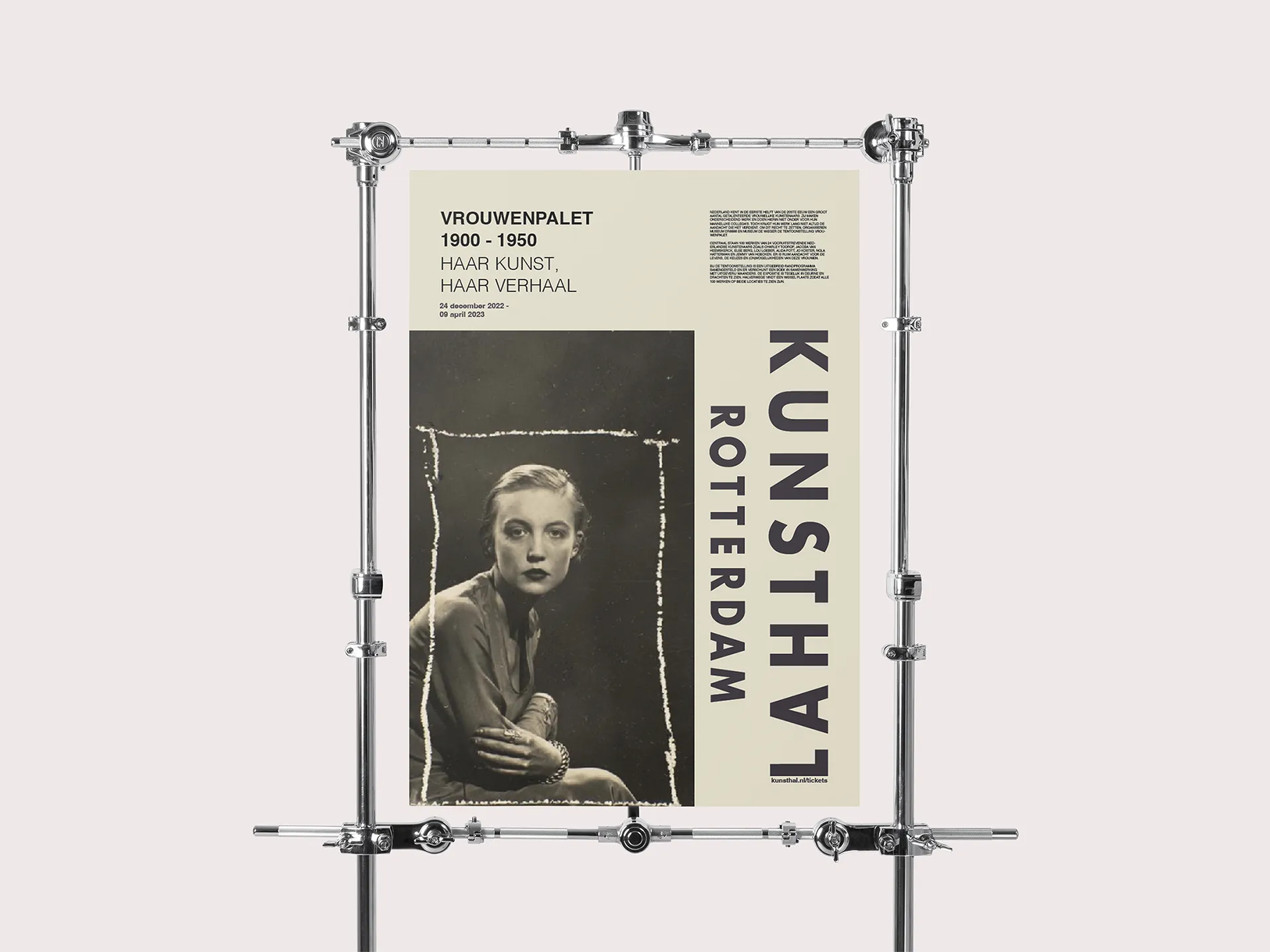
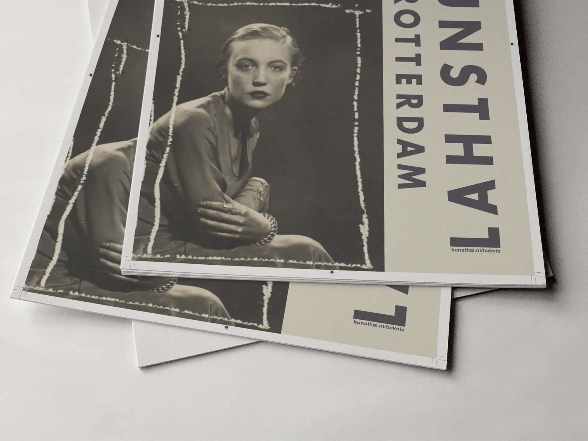
Kunsthal — campaign for a temporary exhibition
Exhibition communication lives or dies in a fraction of a second. Abris and posters have one job: stop someone mid-movement, create an internal response, and make them want to be in that room. There is no time for explanation — only for impact. The campaign for this Kunsthal exhibition was designed around that constraint. The visual does the work the headline doesn't need to.
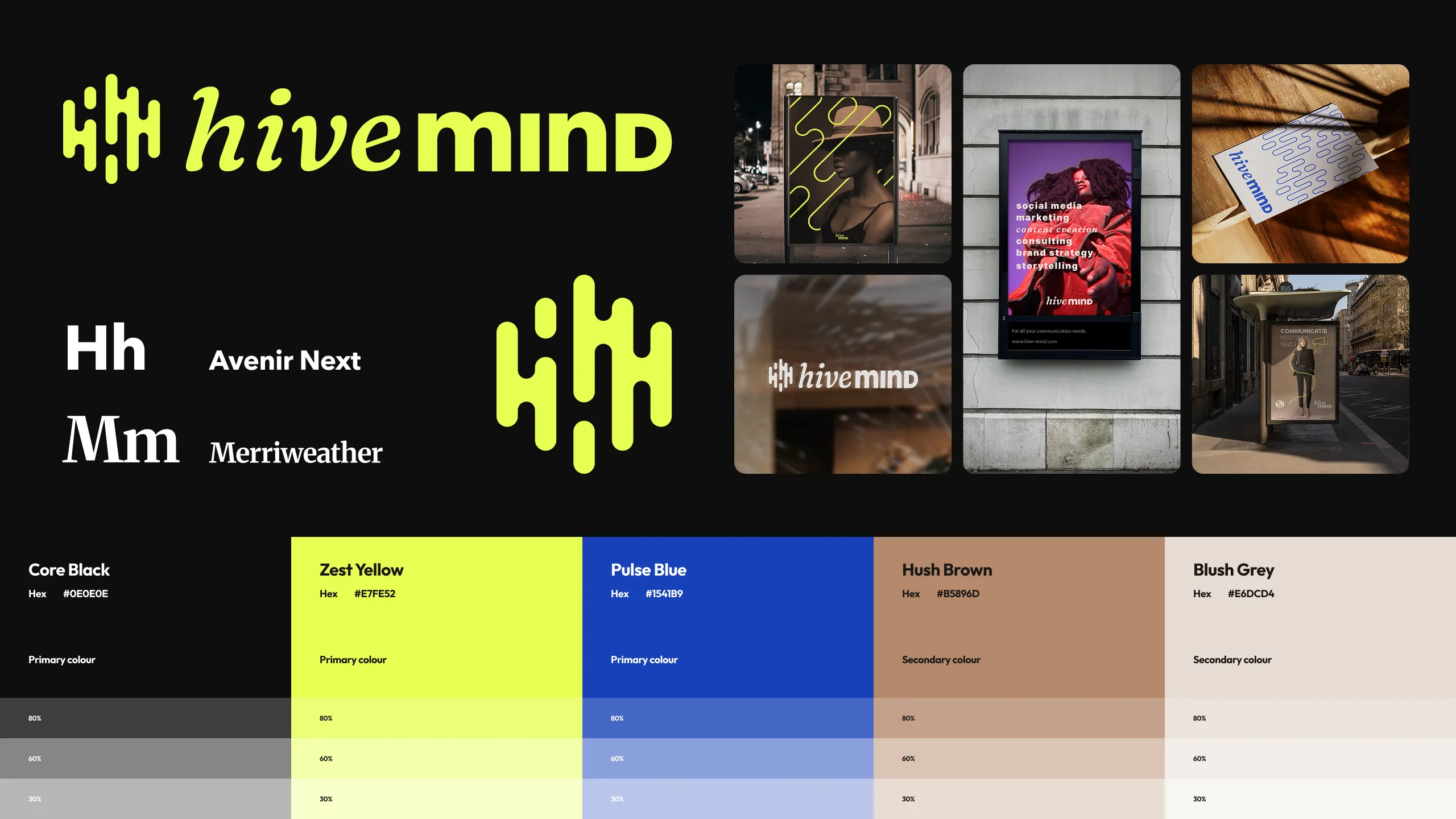
brand study — graduation project
The final project was a full brand build for a new communications consultancy: from strategic positioning through to visual identity system. A complete exercise in translating an organisation's intent into a coherent, workable design language.