Bureau Croissant — Built on Layered Complexity
the brief
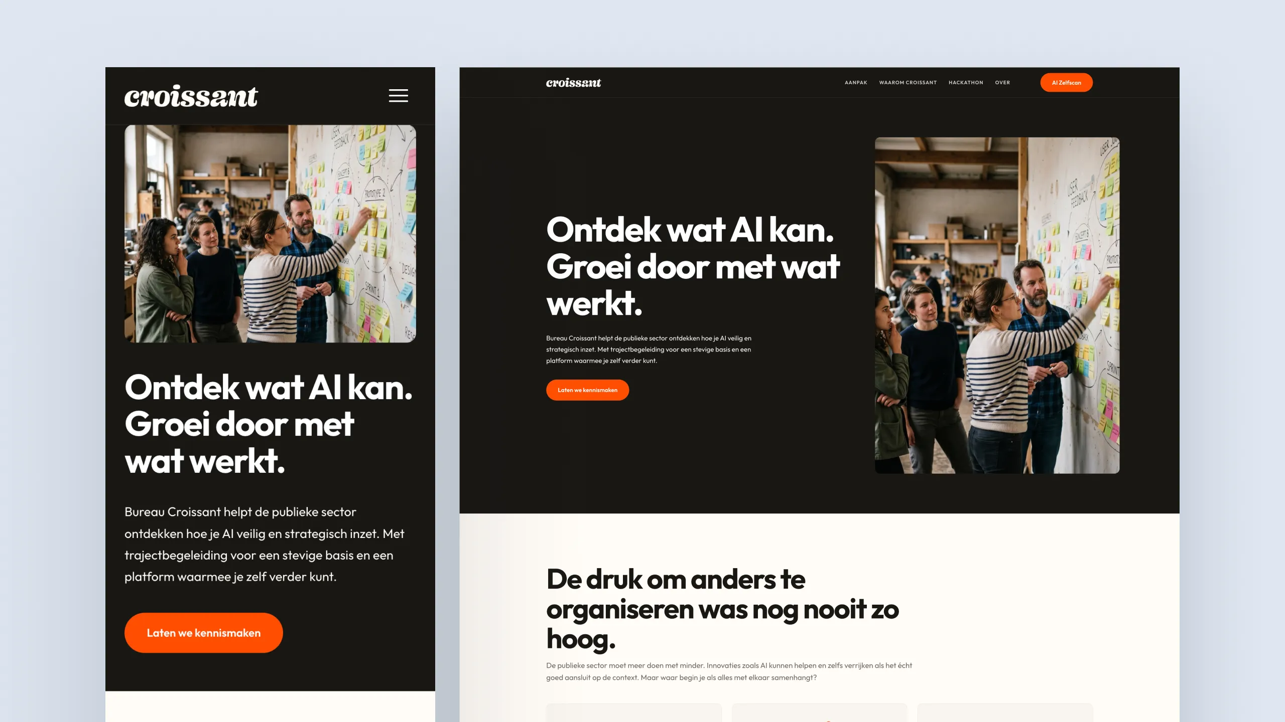
Bureau Croissant helps public sector organisations — healthcare, education, municipalities — navigate AI transitions and build lasting expertise infrastructure. The challenge: designing a brand identity for an organisation that is simultaneously warm and rebellious, evidence-based and approachable, structured and human. The brief in their own words: Different from what you expect from an organisation working within the public domain. Serious, but not dull or boring: they get it.
The croissant metaphor was the strategic foundation, not as a bakery reference, but as a conceptual anchor. Hundreds of layers, made with patience and craft, resulting in something light and satisfying. Not despite the complexity, but because it is handled well.
the identity system
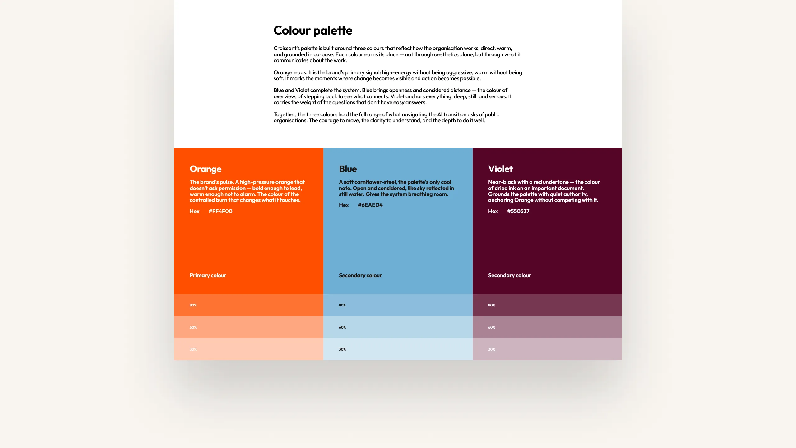
The visual identity had to bridge two worlds: credible enough for risk-averse public sector clients, distinctive enough to signal a modern and genuinely different approach. The palette anchors on three colours: a light strategic blue, a deep burgundy, and an activating orange-red. High contrast, used as accents against near-black type on warm white. Bold, not aggressive. Authority through clarity and personality.
typography & layout
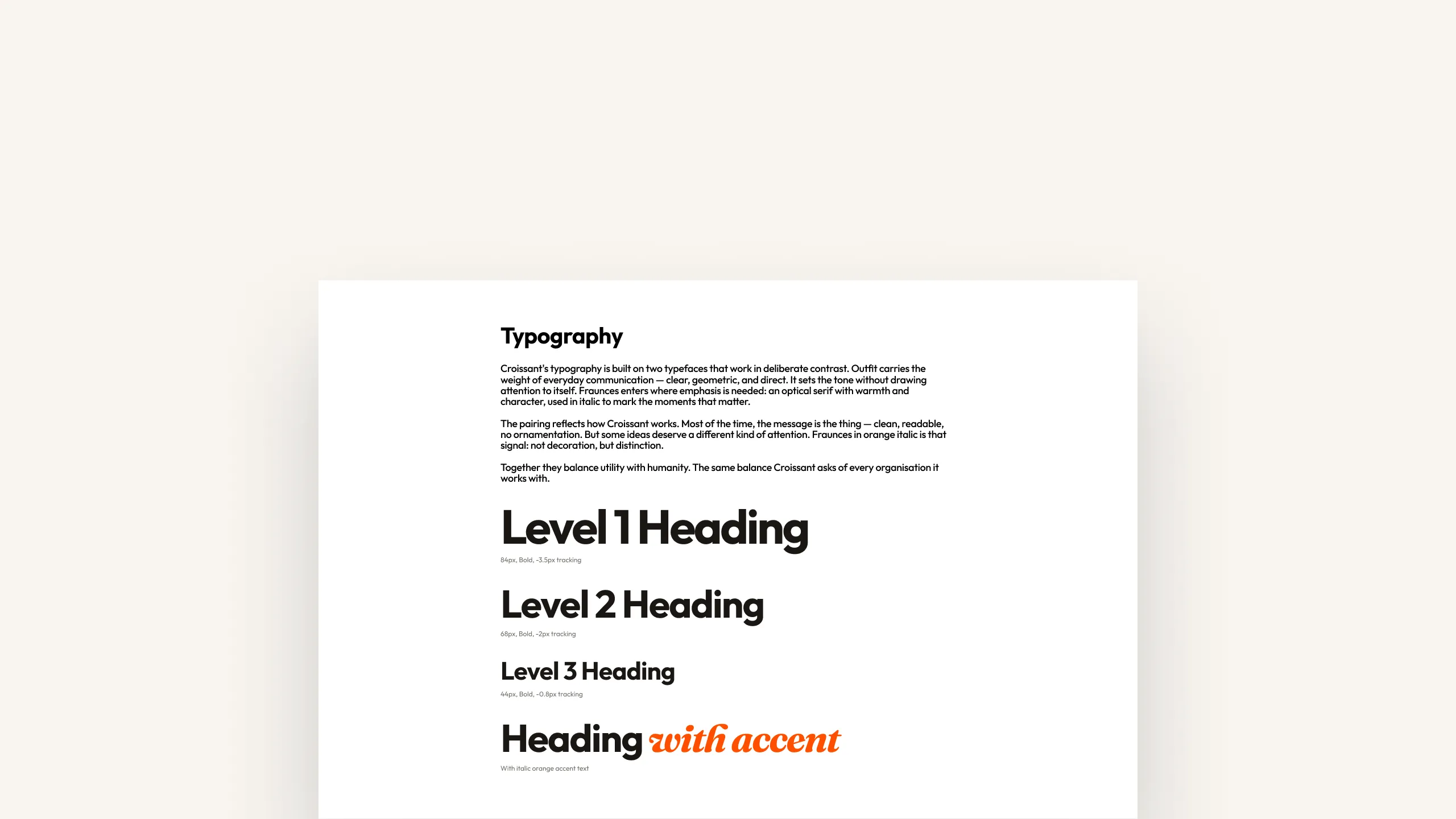
Bold but not heavy. A structured grid with breathing room. The typographic system is clean and modern, with rounded forms that soften the confidence without undermining it. The layout language is simple at its core and complex where the content demands it.
WCAG & accessibility
The website was built WCAG-proof on colour contrast — ensuring the identity holds up not just visually, but technically. Accessibility was treated as a design constraint from the start.
what the brand had to feel like
The gut check was simple: relief first, then curiosity. The brand had to communicate that complexity is welcome here and that it will be handled with care, step by step, at the right pace. Like a croissant: it cannot be rushed. But the result is worth it.
→ See it live: bureaucroissant.nl